Sprout Social | 2023
B2B SaaS
Product Design
Systems Thinking

Project at a glance
ROLE
Lead Designer
TEAM
Product, Engineering, Data Science
TIMELINE
6 months
Overview
I led the design of Network Benchmarking, giving social media managers a way to compare their performance against broader social network trends without having to leave Sprout to find answers. The project was handed off to me with a few months of prior exploration already behind it, but no clear direction. I had to reset the approach before any design work could begin.
Through the work, I collaborated with data science, introduced a brand new metric to Sprout’s reporting offering, defined project scope, designed the benchmarking experience end to end, and laid the groundwork for expanding to new networks and metrics.
Impact
Grew from 2,500 monthly report views shortly after launch to over 4,500 sustained monthly views two years later
Drove a 204% increase in usage of the related Engagement Rate widget within custom reports over 18 months
Eliminated support ticket spikes during network anomalies by giving customers a self-serve way to check broader trends
Customer demand to expand beyond Facebook MVP validated the opportunity, leading to Instagram and LinkedIn support shortly after launch
Opportunity
Give social media managers a way to see how they stack up
Social media managers are constantly proving ROI of social to stakeholders, but had no way to see how their performance compared to broader network trends or industry standards. Customers told support outright that they were leaving Sprout for Google or marketing blogs to find that context. Anomalies made it worse: whenever a network had an issue or a customer’s numbers dipped, support tickets followed, all asking some version of the same question…My performance is down. Is this just me, or is something bigger going on?
The goal was to build benchmarking directly into Sprout’s reporting framework, so customers didn’t have to leave to get answers.
Problem
Inheriting a started effort and a metric problem nobody had solved
The project had been handed off to me with a few months of prior exploration behind it, but no clear direction. As I sat in on project syncs, reviewed the existing work, and listened to customer research calls, one thing became clear: after months of effort, nobody had narrowed in on an approach. There were more open questions than confident answers.
I couldn’t confidently design anything until we defined the data underneath the feature. So I stepped back and made a plan:
Define the benchmarking methodology
Lock down MVP data scope (network vs. industry benchmarks)
Then design the experience
To date, Sprout’s metrics were all volume-based (impressions, engagements, followers), and volume alone can’t fairly compare a small business to a brand like McDonald’s. Even standard medians couldn’t fully solve for that scale problem. The real question wasn’t can we show customers a benchmark..it was how do we create a comparison that’s actually meaningful across businesses with wildly different social footprints?

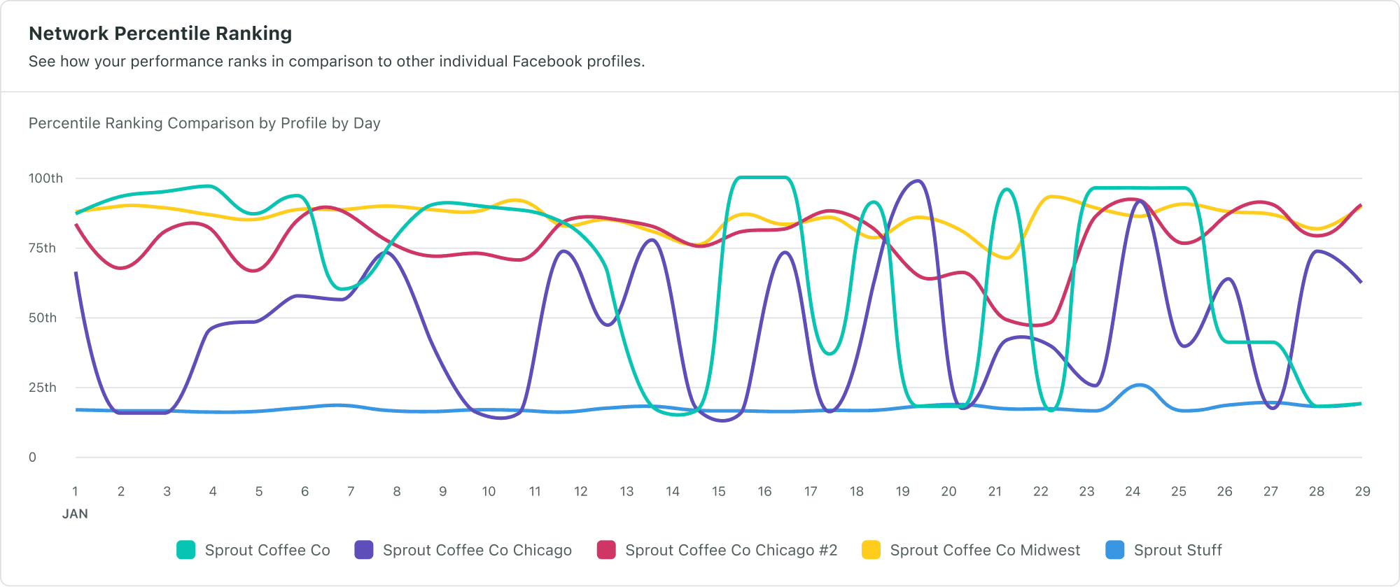
Collaboration with data science and real data helped drive alignment and approach
Approach
Finding the right metric
I partnered with data science to test real customer data against two directions. An early idea, plotting absolute percentile rank over time fell apart immediately. Daily fluctuations made it pure visual noise, with no stable point of comparison. On the other hand, engagement rate (engagements divided by impressions) was a percentage-based metric that was more stable and naturally leveled the playing field between small and large accounts. I shared the explorations and findings with the team, and alignment came fast once the data spoke for itself: engagement rate became our foundational metric.

The new Engagement Rate Widget, delivered as a byproduct of defining the foundational metric behind benchmarking
Designing the Engagement Rate Widget
While engineering built the back end, I quickly designed a companion Engagement Rate Widget in parallel by following our reporting patterns. This enabled us to ship immediate customer value while the harder scope question stayed open: should benchmarking compare customers to the overall social network, or their specific industry?
Narrowing in on the MVP Scope
Product wanted industry-level benchmarks, but I found the underlying data wasn’t reliable. Industry data was manually entered by account managers in Salesforce at sign-up, often left blank or under-specified, and every ad agency customer was bucketed simply as “Agency,” erasing their clients’ real industries. That gap led us to scope the MVP to Network Benchmarking, where our data confidence was solid.

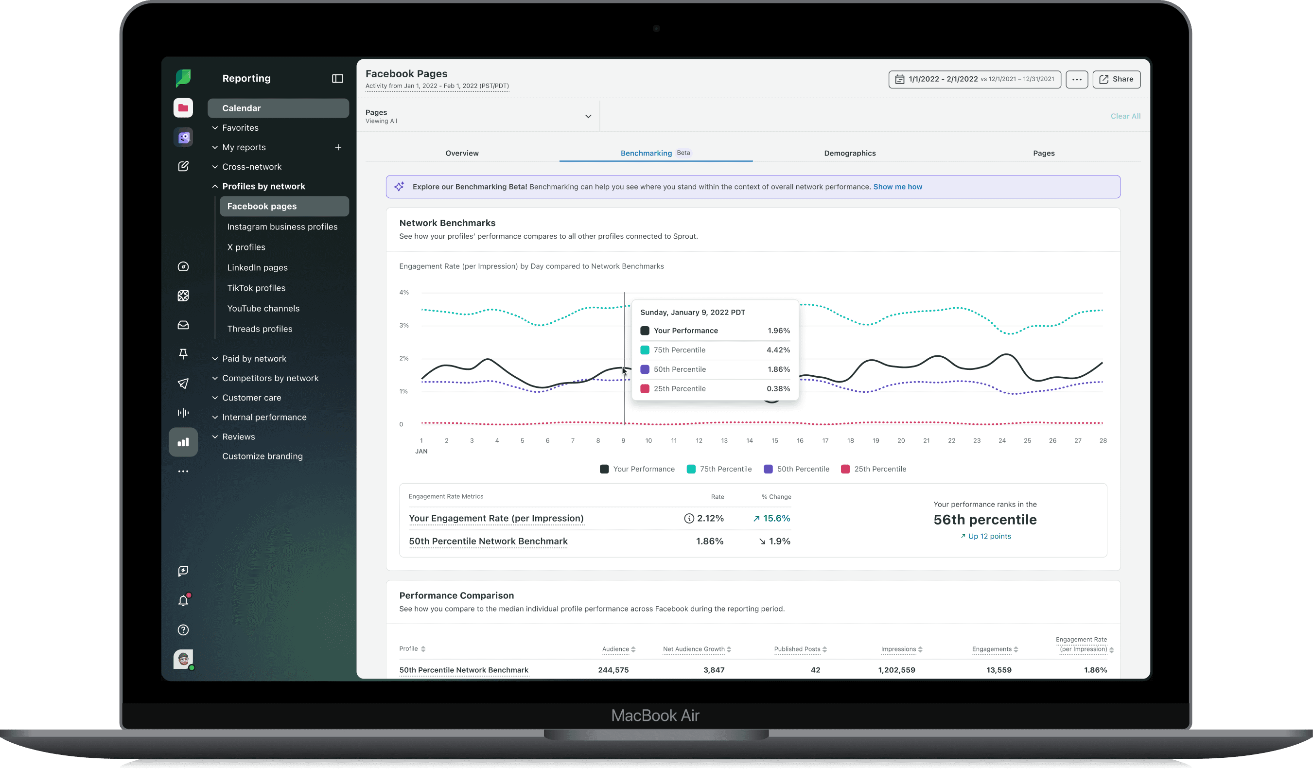
A glimpse at some of the design explorations
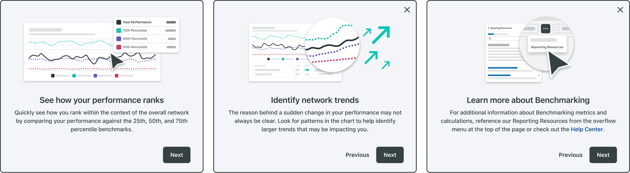
Onboarding walkthrough modals with custom illustrations

In app reporting resource center section dedicated to benchmarking and metric definitions

Real customer data showing a clear trend: Improvement in Instagram performance over the course of a year compared to network average
Result
With Network Benchmarking, customers stopped guessing and started seeing meaningful comparisons
The numbers backed up what the customer signal predicted from the start. Adoption grew steadily:
The companion Engagement Rate Widget saw a 204% usage increase over 18 months.
Benchmarking grew from 2,500 monthly views shortly after launch to over 4,500 sustained monthly views two years later.
The Network Benchmarks widget provided new value for Premium Analytics users while building their custom reports.
Support spikes during anomalies disappeared
Customer demand pushed us to expand Network Benchmarking from Facebook into Instagram and LinkedIn in the following months.